Gnome 3 compare to MacOs
An assertion I have made in the past is that to me "Gnome 3 feels like MacOs with rough edges". After some discussions with others, I'm finally going to write this up with examples.
It's worth pointing out that in my opinion, Gnome 3 is probably still the best desktop experience on Linux today for a variety of reasons - it's just that for me, these rough edges really take away from that being a good experience for me.
High Level Structure Comparison
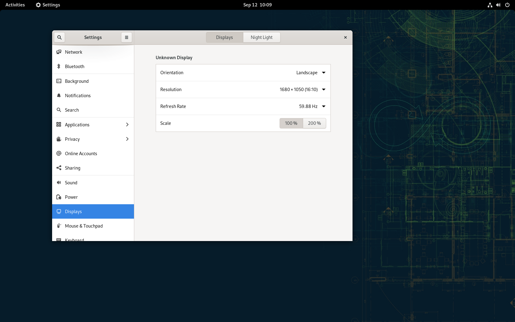
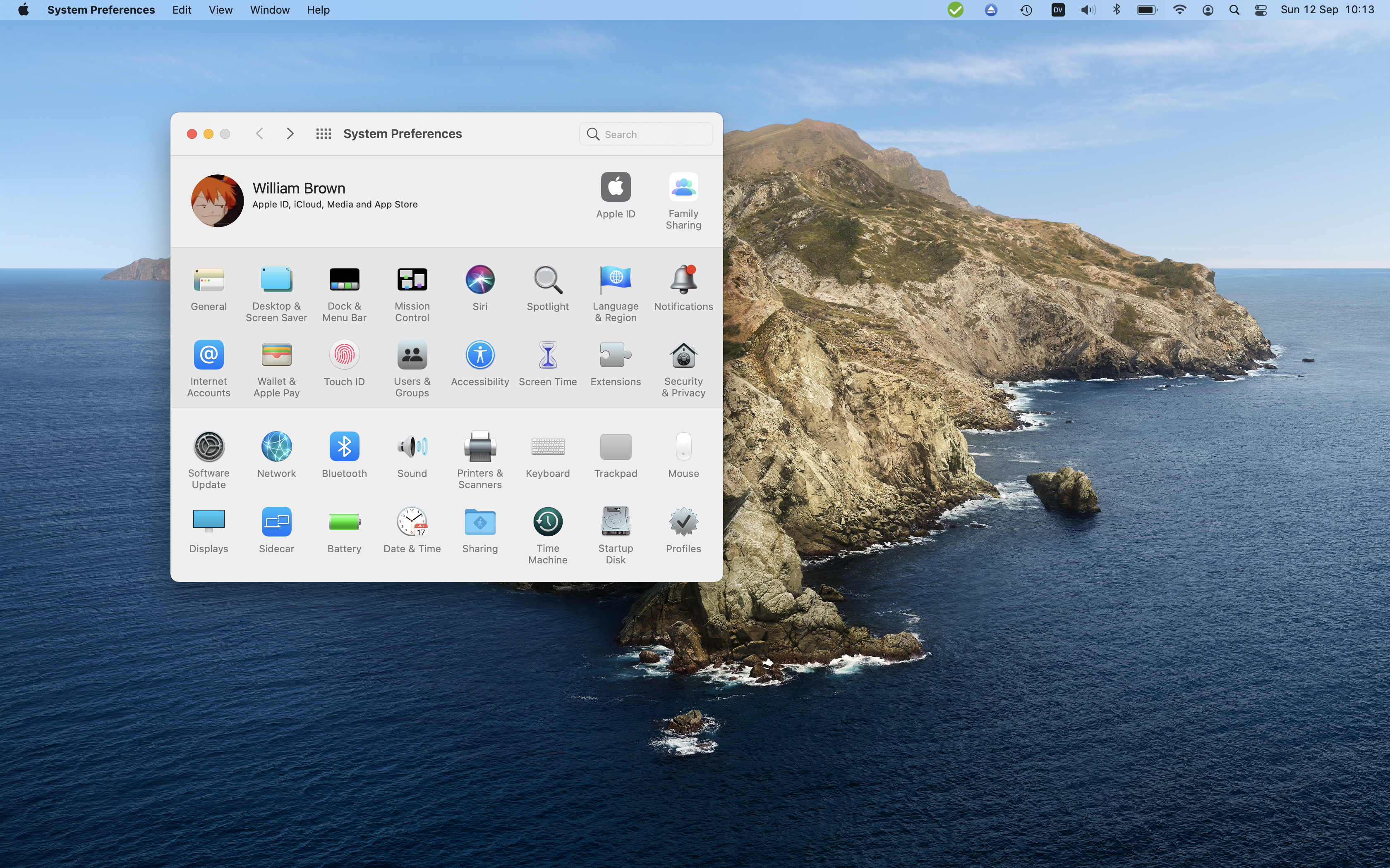
Here's a pair of screenshots of MacOS 11.5.2 and Gnome 40.4. In both we have the settings menu open of the respective environment. Both are set to the resolution of 1680x1050, with the Mac using scaling from retina (2880x1800) to this size.
From this view, we can already make some observations. Both of these have a really similar structure which when we look at appears like this:
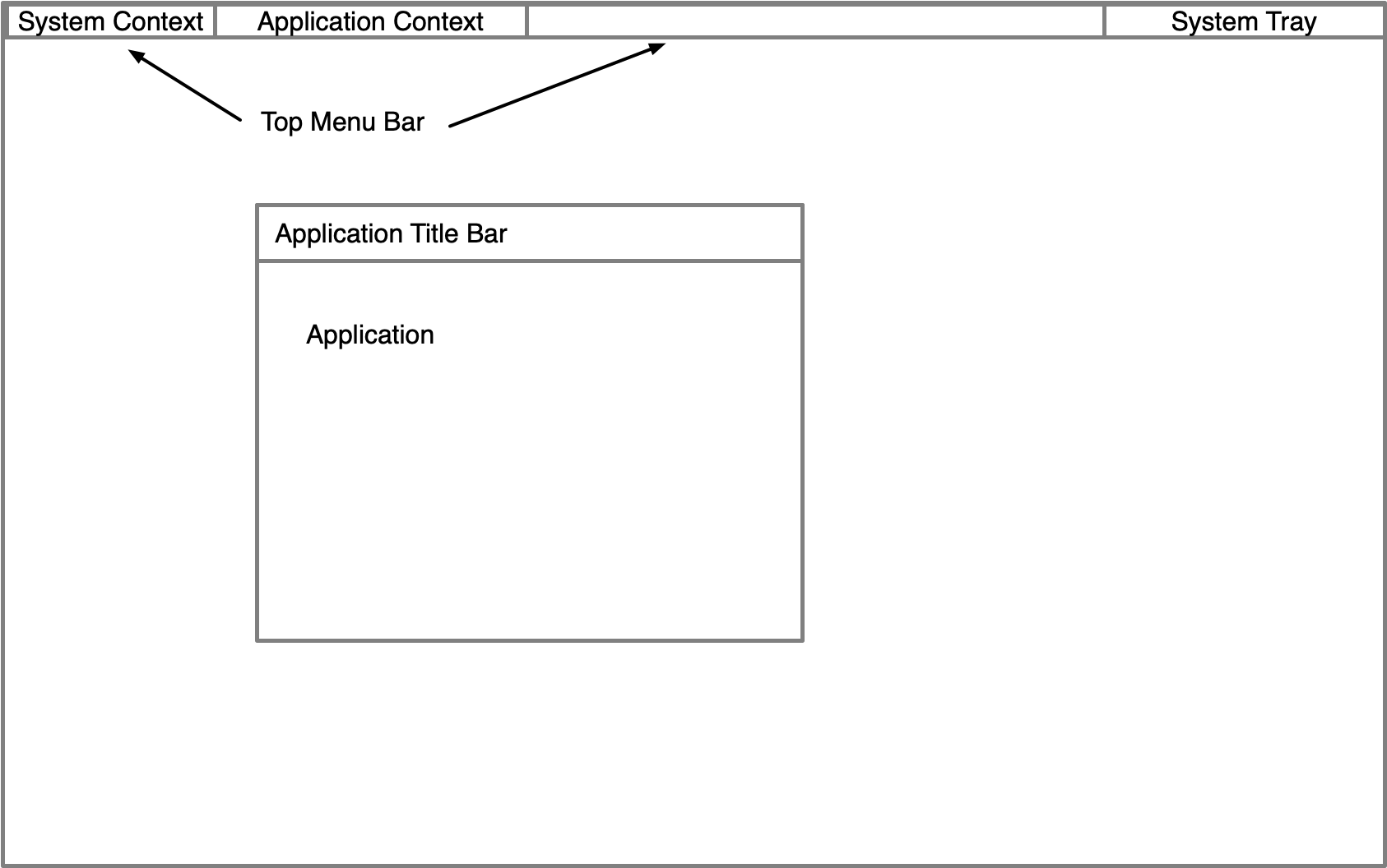
The skeleton overall looks really similar, if not identical. We have a top bar that provides a system tray and status and a system context in the top left, as well as application context.
Now we can look at some of the details of each of the platforms at a high level from this skeleton.
We can see on the Mac that the "top menu bar" takes 2.6% of our vertical screen real-estate. Our system context is provided by the small Apple logo in the top left that opens to a menu of various platform options.
Next to that, we can see that our system preferences uses that top menu bar to provide our application context menus like edit, view, window and help. Further, on the right side of this we have a series of icons for our system - some of these from third party applications like nextcloud, and others coming from macos showing our backup status, keyboard, audio, battery, wifi time and more. This is using the space at the top of our screen really effectively, it doesn't feel wasted, and adds context to what we are doing.
If we now look at Gnome we can see a different view. Our menu bar takes 3.5% of our vertical screen realestate, and the dark colour already feels like it is "dominating" visually. In that we have very little effective horizontal space use. The activities button (system context) takes us to our overview screen, and selecting the "settings" item which is our current application has no response or menu displayed.
The system tray doesn't allow 3rd party applications, and the overview only shows our network and audio status and our clock (battery may be displayed on a laptop). To find more context about our system requires interaction with the single component at the top right, limiting our ability to interact with a specific element (network, audio etc) or understand our systems state quickly.
Already we can start to see some differences here.
- UI elements in MacOS are smaller and consume less screen space.
- Large amounts of non-functional dead space in Gnome
- Elements are visually more apparently and able to be seen at a high level, where Gnome's require interaction to find details
System Preferences vs Settings
Let's compare the system preferences and Settings now. These are still similar, but not as close as our overall skeleton and this is where we start to see more about the different approaches to design in each.
The MacOS system preferences has all of it's top level options displayed in a grid, with an easily accesible search function and forward and back navigation aides. This make it easy to find the relevant area that is required, and everything is immediately accessible and clear. Searching for items dims the application and begins to highlight elements that contain the relevant topic, helping to guide you to the location and establishing to the user where they can go in the future without the need to search. Inside any menu of the system preferences, search is always accesible and in the same consistent location of the application.
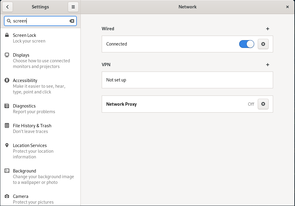
When we look at Gnome, in the settings application we see that not all available settings are displayed - the gutter column on the left is a scrollable UI element, but with no scroll bars present, this could be missed by a user that the functionality is present. Items like "Applications" which have a ">" present confusingly changes the gutter context to a list of applications rather than remaining at the top level when selected like all other items that don't have the ">". Breaking the users idea of consistency, when in these sub-gutters, the search icon is replaced with the "back" navigation icon, meaning you can not search when in a sub-gutter.
Finally, even visually we can see that the settings is physically larger as a window, with much larger fonts and the title bar containing much more dead space. The search icon (when present) requires interaction before the search text area appears adding extra clicks and interactions to achieve the task.
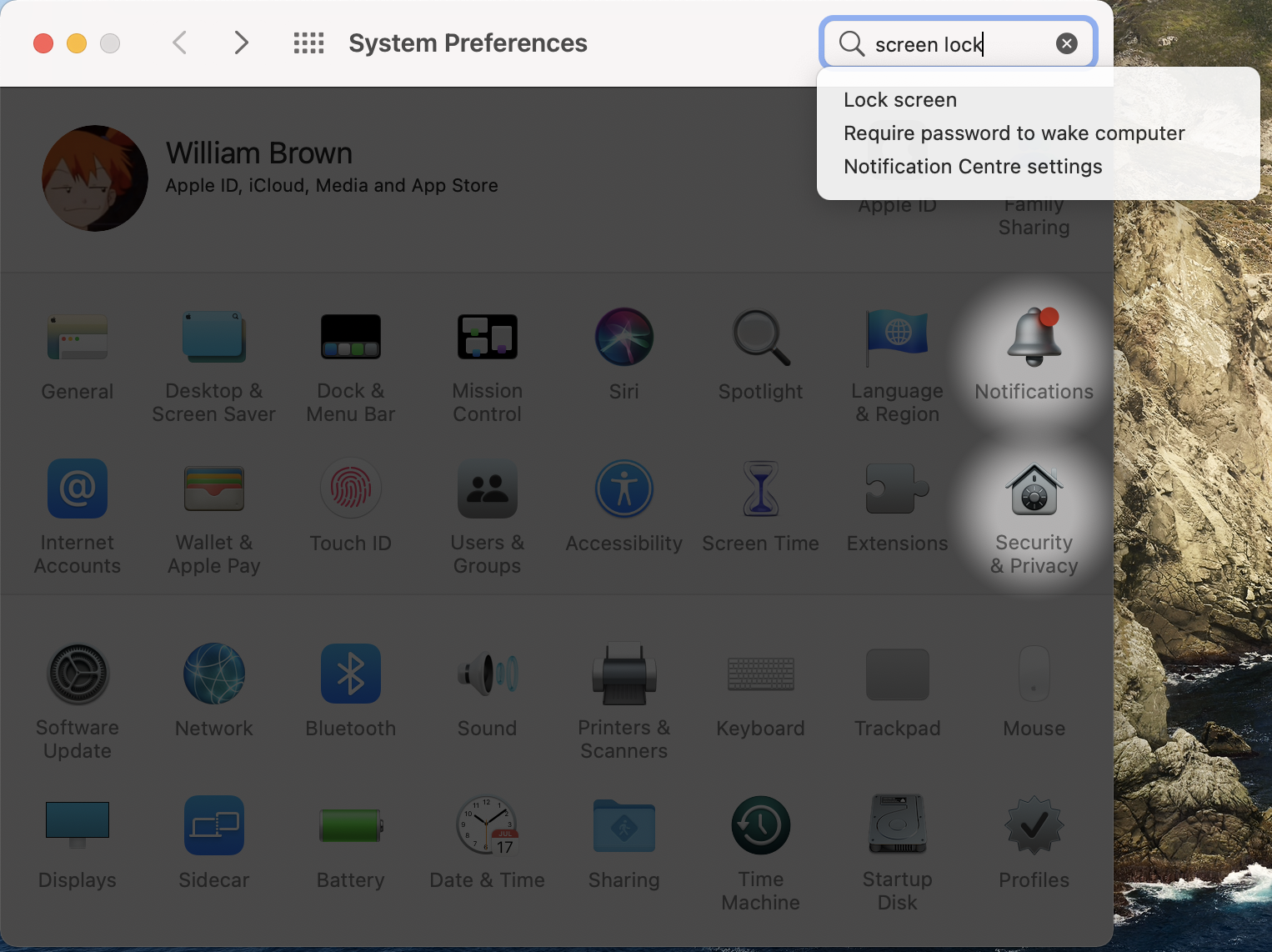
When we do search, the results are replaced into the gutter element. Screen lock here is actually in a sub-gutter menu for privacy, and not discoverable at the top level as an element. The use of nested gutters here adds confusion about where items are due to all the gutter content changes.
Again we are starting to see differences here:
- MacOS search uses greater visual feedback to help guide users to where they need to be
- Gnome hides many options in sub-menus, or with very few graphical guides which hinders discovery of items
- Again, the use of dead space in Gnome vs the greater use of space in MacOS
- Gnome requires more interactions to "get around" in general
- Gnome applications visually are larger and take up more space of the screen
- Gnome changes the UI and layout in subtle and inconsistent ways that rely on contextual knowledge of "where" you currently are in the application
Context Menus
Lets have a look at some of the menus that exist in the system tray area now. For now I'll focus on audio, but these differences broadly apply to all of the various items here on MacOS and Gnome.
On MacOS when we select our audio icon in the system tray, we are presented with a menu that contains the current volume, the current audio output device (including options for network streaming) and a link to the system preferencs control panel for further audio settings that may exist. We aren't overwhelmed with settings or choices, but we do have the ability to change our common options and shortcut links to get to the extended settings if needed.
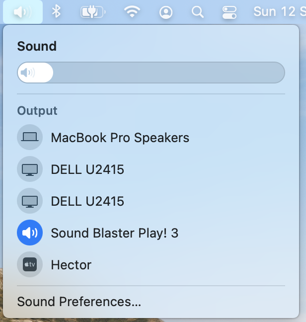
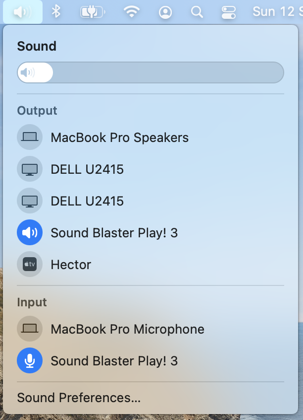
A common trick in MacOS though is holding the option key during interactions. Often this can display power-user or extended capabilities. When done on the audio menu, we are also able to then control our input device selection.
On Gnome, in the system tray there is only a single element, that controls audio, power, network and more.
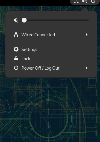
All we can do in this menu is control the volume - that's it. There are no links to direct audio settings, device management, and there are no "hidden" shortcuts (like option) that allows greater context or control.
To summarise our differences:
- MacOS provides topic-specific system tray menus, with greater functionality and links to further settings
- Gnome has a combined menu, that is limited in functionality, and has only a generic link to settings
- Gnome lacks the ability to gain extended options for power-users to view extra settings or details
File Browser
Finally lets look at the file browser. For fairness, I've changed Gnome's default layout to "list" to match my own usage in finder.
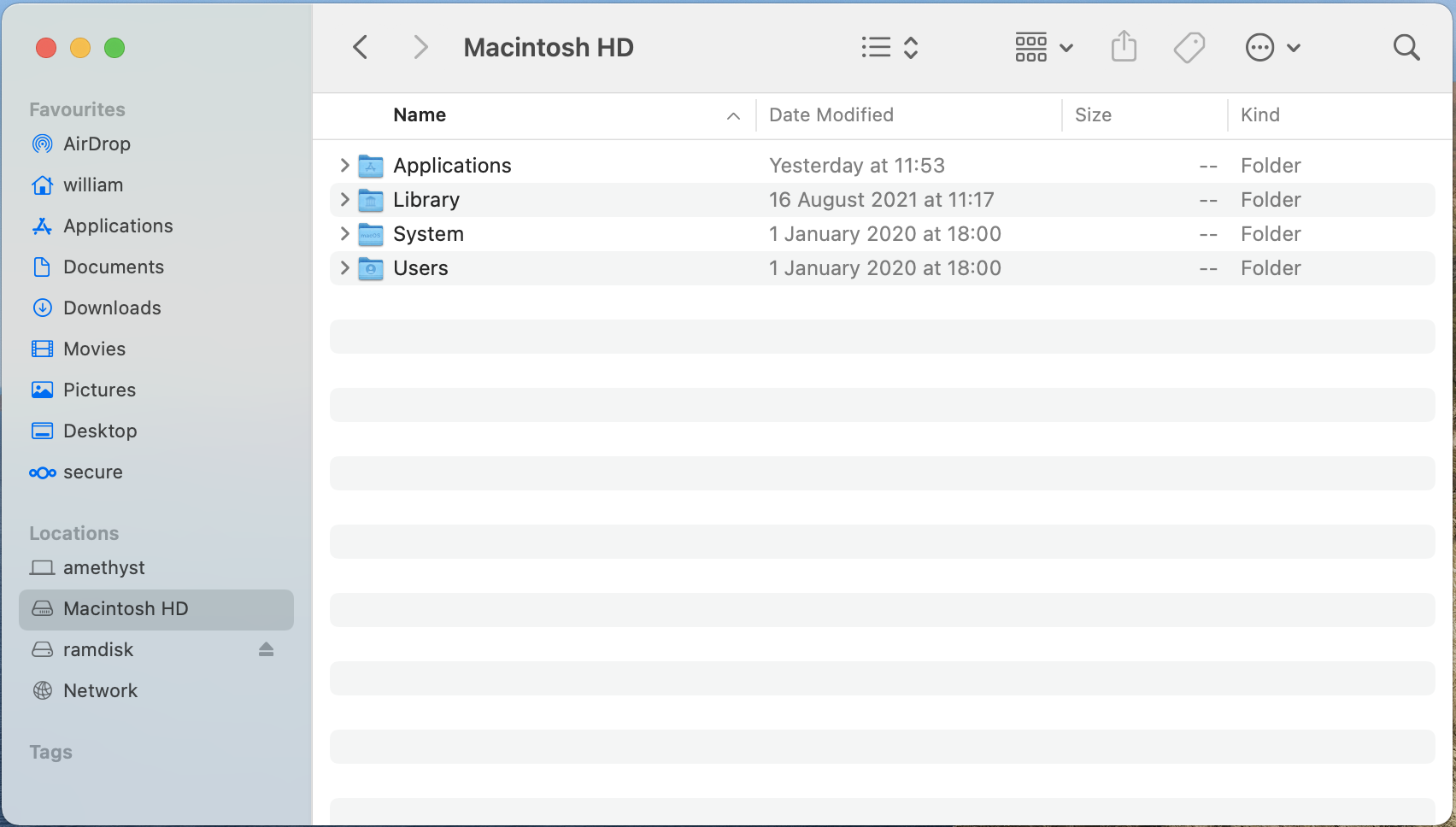
We can already see a number of useful elements here. We have the ability to "tree" folders through the ">" icon, and rows of the browser alternate white/grey to help us visually identify lines horizontally. The rows are small and able to have (in this screenshot) 16 rows of content on the screen simultaneously. Finally, not shown here, but MacOS finder can use tabs for browsing different locations. And as before, we have our application context menu in the top bar with a large amount of actions available.
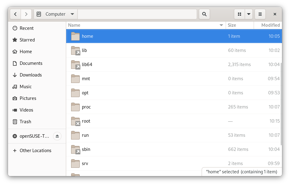
Gnomes rows are all white with extremely faint grey lines to delineate, making it hard to horizontally track items if the window was expanded. The icons are larger, and there is no ability to tree the files and folders. We can only see ~10 rows on screen despite the similar size of the windows presented here. Finally, the extended options are hidden in the "burger" menu next to the application close.
A theme should be apparent here:
- Both MacOS and Gnome share a very similar skeleton of how this application is laid out
- MacOS makes better use of visual elements to help your eye track across spaces to make connections
- Gnome has a lot of dead space still and larger text and icons which takes greater amounts of screen space
- Due to the application context and other higher level items, MacOS is "faster" to get to where you need to go
Keyboard Shortcuts
Keyboard shortcuts are something that aide powerusers to achieve tasks quicker, but the challenge is often finding what shortcuts exist to use them. Lets look at how MacOS and Gnome solve this.
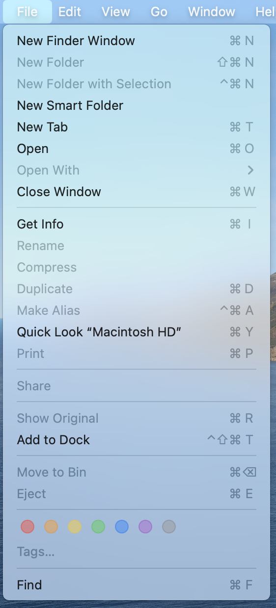
Here in MacOS, anytime we open a menu, we can see the shortcut listed next to the menu item that is present, including disabled items (that are dimmed). Each shortcut's symbols match the symbols of the keyboard allowing these to be cross-language and accessible. And since we are in a menu, we remain in the context of our Application and able to then immediately use the menu or shortcut.
In fact, even if we select the help menu and search a new topic, rather than take us away from menu's, MacOS opens the menu and points us to where we are trying to go, allowing us to find the action we want and learn it's shortcut!
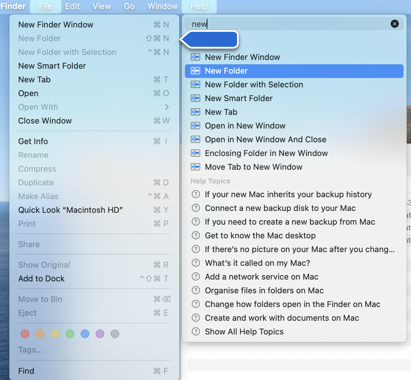
This is great, because it means in the process of getting help, we are shown how to perform the action for future interactions. Because of the nature of MacOS human interface guidelines this pattern exists for all applications on the platform, including third party ones helping to improve accessibility of these features.
Gnome however takes a really different approach. Keyboard shortcuts are listed as a menu item from our burger menu.
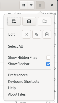
When we select it, our applications context is taken away and replaced with a dictionary of keyboard shortcuts, spread over three pages.
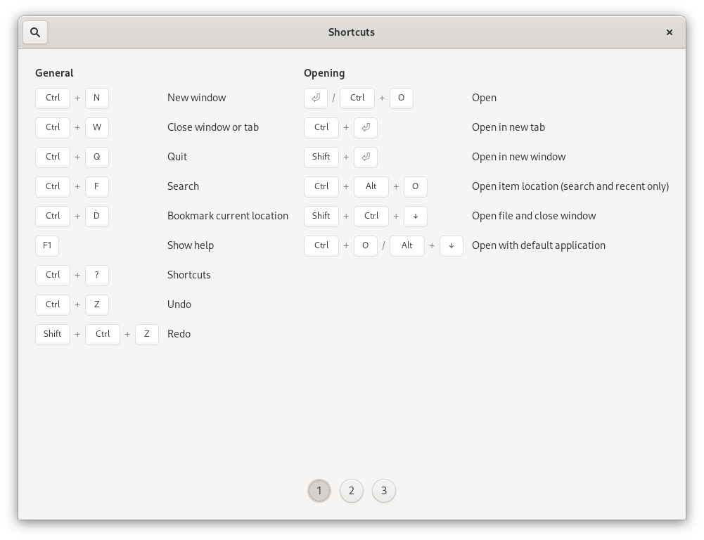
I think the use of the keyboard icons here is excellent, but because we are now in a dictionary of shortcuts, it's hard to find what we want to use, and we "taken away" from the context of the actions we are trying to perform in our application. Again, we have to perform more interactions to find the information that we are looking for in our applications, and we aren't able to easily link the action to the shortcut in this style of presentation. We can't transfer our knowledge of the "menus" into a shortcut that we can use without going through a reference manual.
Another issue here is this becomes the responsibility of each application to create these references and provide them, rather than being an automatically inherited feature through the adherence to human interface guidelines.
Conclusion
Honestly, I could probably keep making these comparisons all day. Gnome 3 and MacOS really do feel very similar to me. From style of keyboard shortcuts, layout of the UI, the structure of it's applications and even it's approach to windowing feels identical to MacOS. However while it looks similar on a surface level, there are many rough edges, excess interactions, poor use of screen space and visual elements.
MacOS certainly has it's flaws, and makes it's mistakes. But from a ease of use perspective, it tries to get out of the way and show you how to use the computer for yourself. MacOS takes a back seat to the usage of the computer.
Gnome however feels like it wants to be front and centre. It needs you to know all the time "you're using Gnome!". It takes you on a small adventure tour to complete simple actions or to discover new things. It even feels like Gnome has tried to reduce "complexity" so much that they have thrown away many rich features and interactions that could make a computer easier to use and interact with.
So for me, this is why I feel that Gnome is like MacOS with rough edges. There are many small, subtle and frustrating user interactions like this all through out the Gnome 3 experience that just aren't present in MacOS.